How to Use DAFNI's Visualisation Tools
Creating and Starting a DAFNI Visualisation
In DAFNI, a visualisation can be created via two different routes.
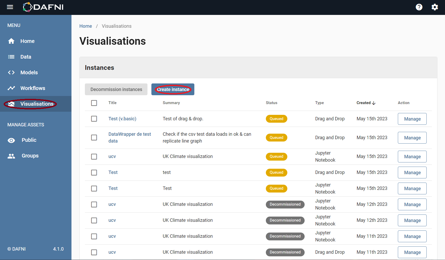
The first route is to manually create a visualisation using the "Create Instance" button (after the visualisation stage has been selected on the left hand side menu). This is shown in the image above. The second way is to run a workflow that has an intrinsic visualisation step already set up (publish+visualise). If you have already created and run such a workflow you will already be able to find it among the list of visualisations (these can be seen in the image, under instances).
There are - broadly speaking - two different types of visualisation currently supported in DAFNI, the first type of visualisation uses Jupyter, which is a powerful tool for analysing data (this data can be provided in variety of formats). Typically one would write python code (or one of the other supported scripting languages, Julia and R) within a Juptyer notebook, in order to analyse the data which will also stored in the DAFNI visualisation instance.
If you are unfamiliar with using notebooks it is recommended that you check-out the introductory page on the Jupyter website. The setup on this page will be very similar to what you will see when starting a Jupyter instance using DAFNI, and you will also be able to experiment on the Jupyter site.
The second type of visualisation in DAFNI is the Drag & Drop interface, which will open an graphing interface where you can load in csv files and create simple visualisations using the data contained. If you have data in csv format which you wish to look at, this interface can be used to quickly look at the data and plot simple graphs (note, csv may not be the most suitable output format for your data, especially when considering large datasets).
Manually Creating a Visualisation
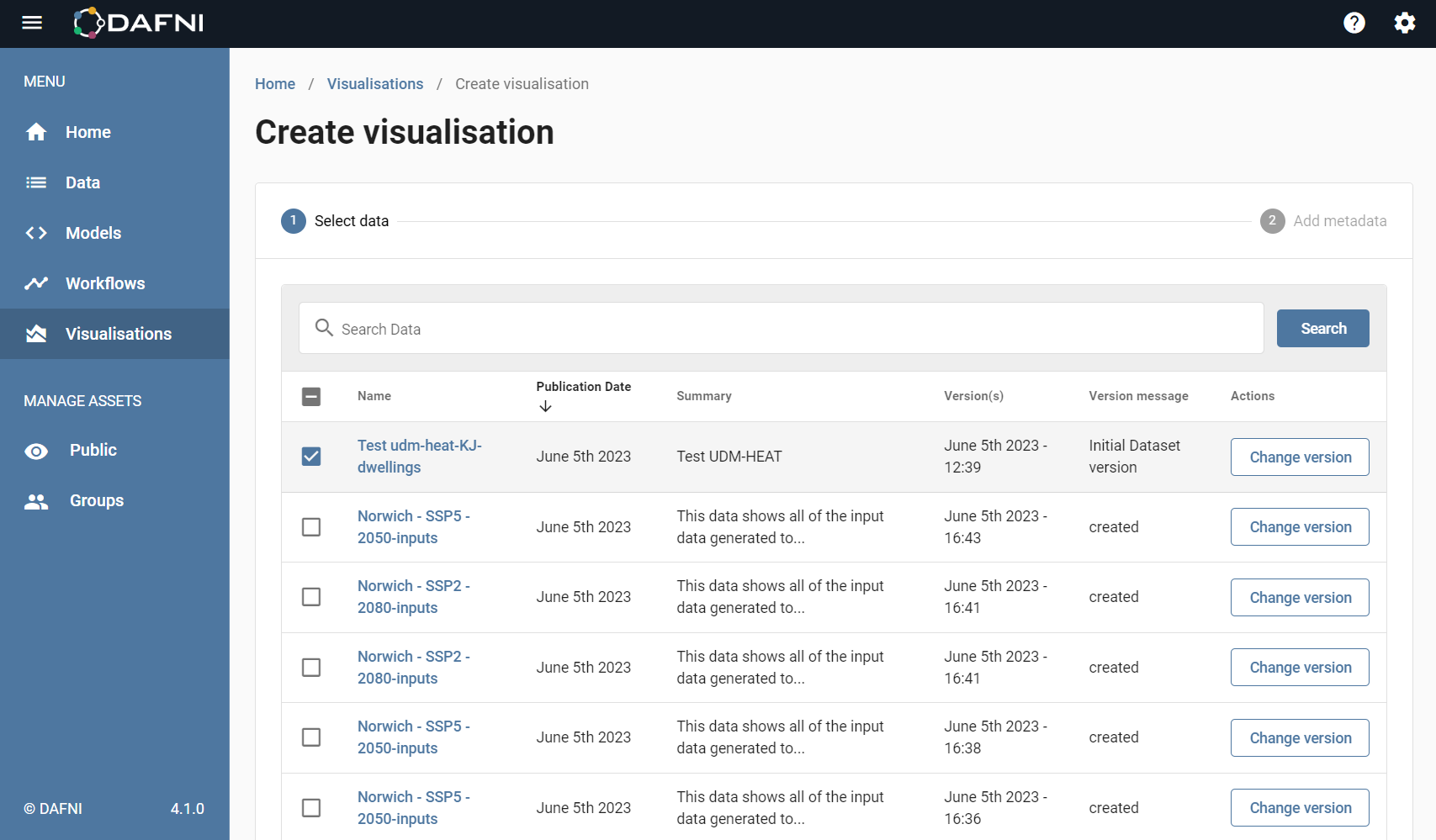
If you want to manually create a visualisation you first have to upload the data you wish to look at (unless it is already registered in DAFNI). After having done this, you should then go to the visualisations tab as described in the previous section and click on Create Instance (as shown above). After this page you should select a dataset, or datasets, by clicking on the box next to the name (it will be ticked if selected).
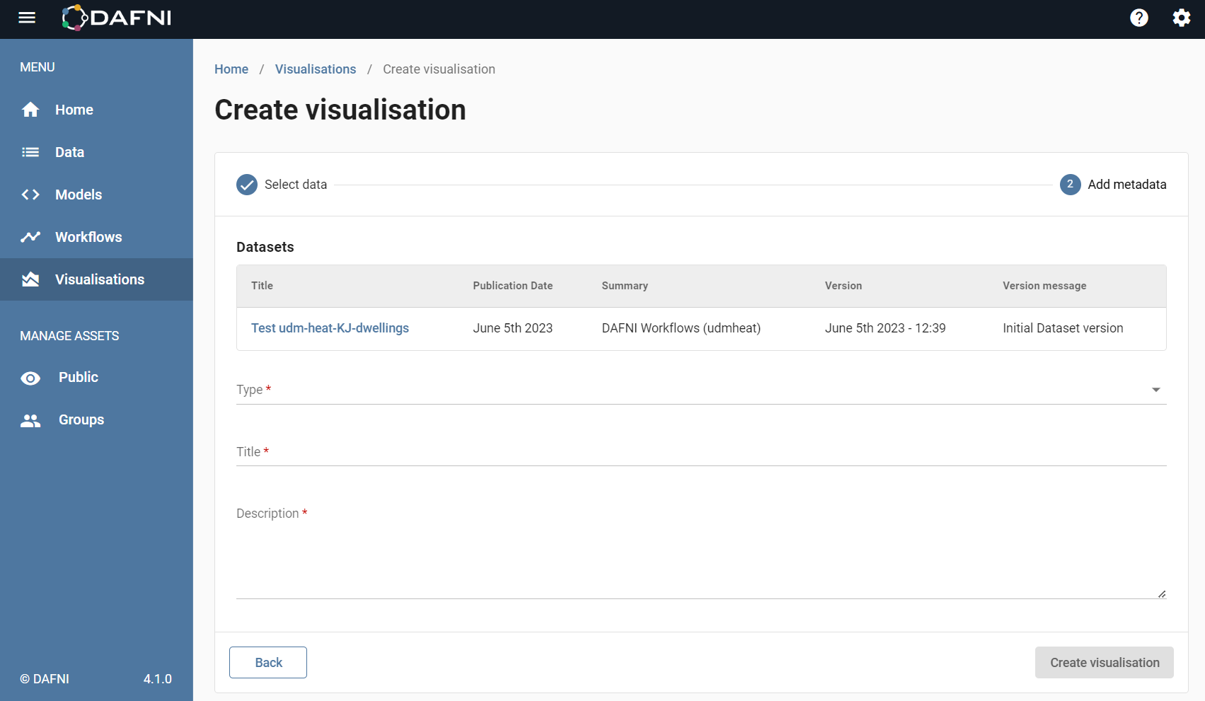
After you have selected the data left click on "Add metadata" (bottom right of screen) to go to the next form. Here you can select the type and give the visualisation a name and description (this should clearly identify your visualisation so you can find it in the future).
Creating a Visualisation as part of a Workflow
In order to create a visualisation as part of a workflow you should include a visualisation step in your workflow. After running the workflow, a visualisation will be automatically included in DAFNI, and will appear in the visualisation instance list. More details on how to do this can be found in the Workflow guide.
Using Jupyter Notebooks in DAFNI (python)
When you start a visualisation that uses Jupyter in DAFNI you will see a screen that looks like that shown below. This is the screen as it appears the 1st time you launch the visualisation, if you have used this particular visualisation before it will remember the scripts you have written in the instance.
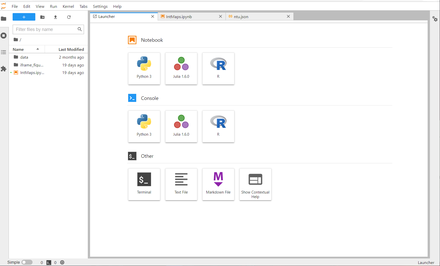
By clicking the python option you can launch a python notebook, which gives you access to an interactive python script, where you can load in the data that comes attached to the visualisation instance.
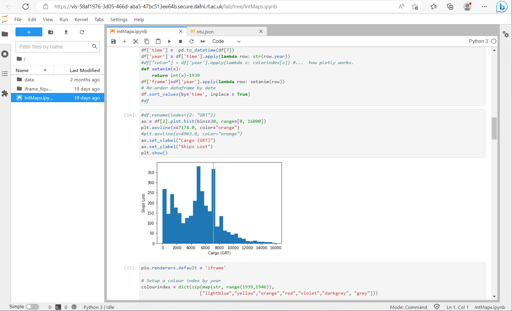
It should be noted that the path to the data includes a directory named after the instance (the long line of letters & numbers). You can hard-copy this from the file explorer on the left, but it is better to obtain the path in the code (as shown below in the note).
Note: In order to access the data you will need to access the output path in the visualisation, this can easily be done using the code below (the listdir command will return the visualisation ID code, which should be the name of the only folder). The example below will return the path to the json file
datfolder = os.path.join(os.environ.get("HOME"), "data")
jsonpath = os.path.join(datfolder, os.listdir(datfolder)[0], "ntu.json")
This returns the path to the file: eg. $HOME/data/c008971a-d4f2-46eb-9bdc-120a0f1dc898/ntu.json
After you have have done this you can then proceed as you normally would with a python script and plot graphs, and analyse the data.
Important: If you want to save a graph from a python notebook, you can hold shift and right click on the graph which will bring up a menu with the option to save the graph as an image.
It is recommended that the you look at the WW2 Shipping Losses example, which gives an example notebook along with a json data sample. There is also the French Road Accident example, which also includes a notebook which demonstrates how to run a simple fit procedure on output data. These can both be found in examples , along with the UK Climate example (the code in the visualisation.py file can be run in a notebook).
Using the Drag and Drop interface in DAFNI
When a visualisation is created with the drag & drop option, the screen that will appear looks like the one shown below. It is currently possible to load in csv files and select them using the options shown on the image.
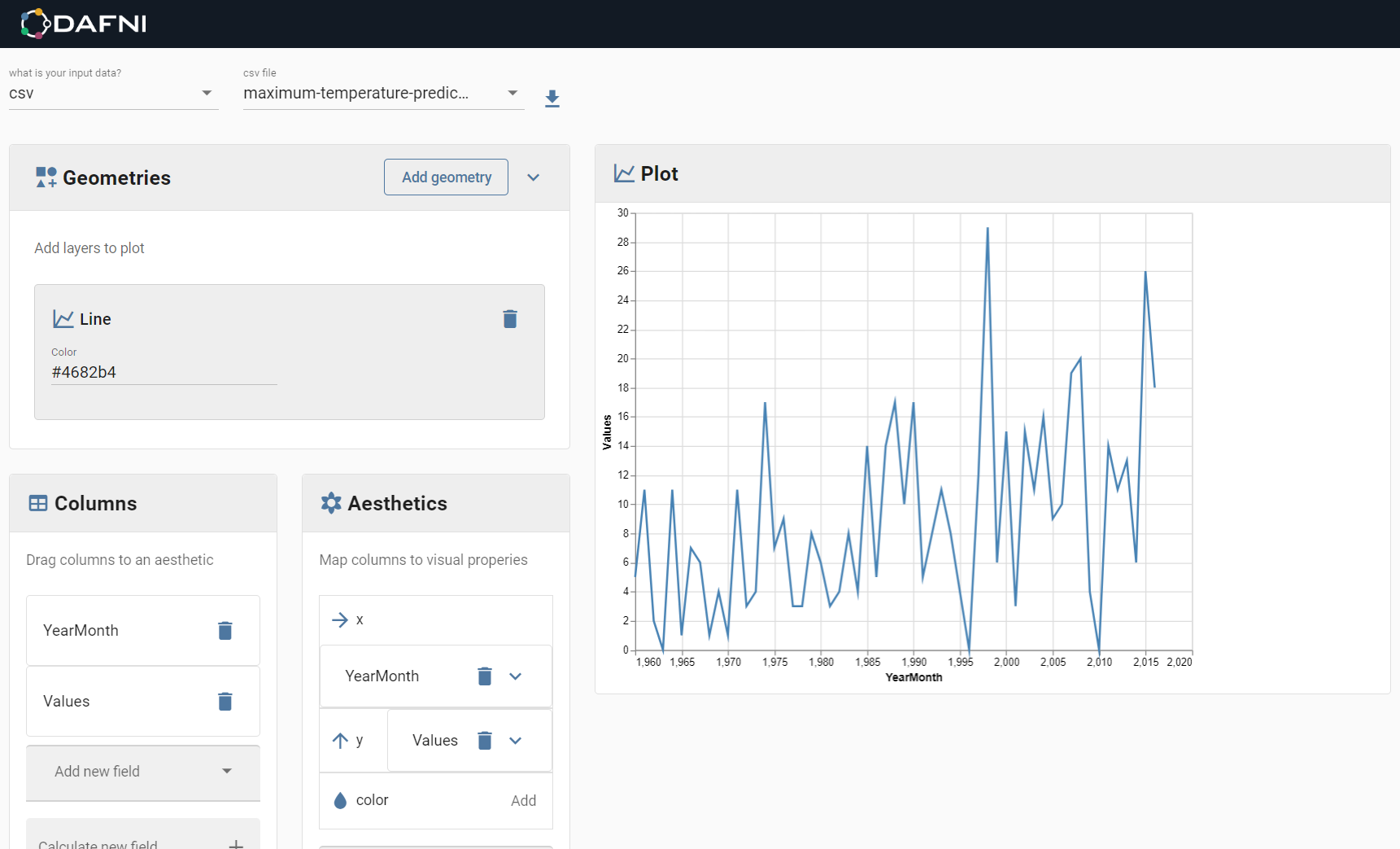
Note: You should ensure that csv file is well formatted and error free, and that it has been properly selected at the loading stage. It should also be noted that semi-colon delimiters will not be properly interpreted (you can use excel to convert them to commas).
After you have loaded in the data you can select a visualisation type by clicking on geometries and selecting a type (for example, lines, points or bars). This creates a layer in the plot you are creating, of that specific type. After doing all this you should be able to see your data columns that have been read in from the csv file in 'Columns'. You can drag and drop these into the asthetics boxes (for x and y) to define the input data - note that you will have to provide both an x and y co-ordinate set for your data points, as the x co-ordinate will not be set automatically like it would be in excel, for example. Note that the functionality is currently quite basic, and jupyter is recommended for more sophisticated plots.
